January and March, 1981
Volume 1, number 1 of ThroTTle magazine was printed January 14, 1981 in an edition of 1,000 copies then delivered by the six “employees” (Pahnelas, Blake, Brumfield, Sampson, Moore and Seneker) to various businesses around the fan, including Carriage House Book store, the Village Restaurant, Grace Place, Bohannons Records and Tapes, the Album Den, Jade Elephant, SanDors, Biograph Theater, Don’s Hot Nuts, and at various locations around VCU. They asked permission before dropping a couple hundred unknown tabloid magazines inside the foyers and on the newsstands of those businesses, and they were refused only in a couple locations: a seafood market in what later became the Safeway parking lot later in the year absolutely refused to let the magazine be left there, as did Sunny Day clothing store at Harrison and Grace (they relented with issue #2, however, and were reliable supporters and advertisers for years,).
Capital News Service, the mafia-like periodical procurement service that controlled delivery of just about every magazine in Richmond objected in several stores to ThroTTle’s presence in what they deemed “their” spaces on the book shelves, prompting some creative stocking changes, with most of the magazine being left inside doorways and in places other than the news racks. But that was OK – there was less chance ThroTTle would get buried or thrown out by Capital delivery goons, which really happened in a few bookshops, including SanDors.
Issue #1 was 8 pages of disjointed news, fiction, photography, satire and art. The cover was a grey mish-mash of that girl from the 1946 life Magazine, surrounded by Tiger Paw tires and a string of random numbers pasted on the bottom. Page 2 featured an excellent Tim Wright photo shot by him as he got drunk at Richmond airport waiting for his flight to leave, over a black vitals box, featuring an image of Dale Brumfield pressing his face on a Xerox machine, spreading his eye open.
Advances in photocopier technology at that time led to copy machines becoming artists tools, with “Xerox Art” shows popping up at the Anderson Gallery and the brand new 1708 Gallery, which at that time really was at 1708 East main Street.
Page 3 featured a fiction piece by Milton scholar Jack Moore called “Paradise Destroyed”, with a somewhat appropriate Ronnie Sampson illustration featuring Jesus elevating a piggy and a toaster.
The center truck contained 2 stories: a piece about 1980’s place in history by Commonwealth Times Managing Editor Dale Davis and Peter Blake’s fictionalized “Twisted Tots go Cruising”, about people going “cruising”, not “going crazy”, as described in the previous post.
Page 6 contained a Bill Pahnelas fiction (we hope) piece entitled “The Pizza Box”, about teenage boys despoiling a pizza box to impress their girlfriends. The wonderful primitive illustration on that page was drawn by a mysterious recluse named Kevin Giacobbe, a bank IT analyst by day and a Howard Finster-style artist by night. Kevin lived in an apartment in the west end that he shared with about 9 or 10 cats, and he became the subject of a centerspread feature in issue #2 called “Cats, Computers and Concrete”. Kevin drew an unforgettable mural in his untrained, whimsical style on the wall in the Commonwealth Times typesetting room that was admired for years until it was painted over in 1984.
Graphic Arts student (now Professional Graphic Artist) Nancy Martin labored for hours with Letraset press type to create the “Pleasure Abounds in the Eighties” illustration. She married Ronnie Sampson in 1984 and God bless them, they are still married today, and living in San Francisco.
Page 7 became the fun television page. The first installment of what became a regular feature for 6 issues of Dale’s “Tonight’s TV” appeared. The feature was a paste-up pain in the posterior: the typesetting equipment could not produce the tiny TV screen-shaped channel numbers, so they had to be photo-statted from the Richmond News-Leader’s “Green Section”, then cut out with an Exacto knife, waxed and pasted into place. The “Fight Robert Louis Stevenson” 7-day fling in Finland ad was created by Rob Sauder-Conrad. Local anarchist but nice guy Paul Mazzuca wrote the obituary for Marshal McLuhan, and local media writer D. Shone Kirkpatrick penned the dreamy “Watching Bad TV” piece. The creators saw a theme on this page, and they obviously ran with it.
Writer and Editor Susan Higginbotham talked about moving to New York endlessly in the office, at parties and probably at home by herself as she smoked one Virginia Slim after another, but returned to Richmond after an abortive attempt at living there, the bitter miasma of the big apple fouling her sensibilities. The back page featured a journal by her about her abortive attempt to move, live and work in New York City. “I am no longer a walking cliché,” she lamented, “I am now an ex-New Yorker.” The chaotic drawing of a New York City street was drawn directly on the photo-blue grid sheet by Dale Brumfield.
In the far right bottom corner of the page a very light Brumfield character can be seen waving and saying “S’long”, scratched into the page negative with a child’s compass at the Herald Progress Newspaper before the plate was shot, just to fill a space.
ThroTTle was no reincarnation of the hard-hitting political Richmond Mercury; nor was it a newsy broadsheet like the old Chronicle and certainly not the Times-Dispatch or News Leader – ThroTTle was alone in its eccentric hodge-podge of arts, fiction and commentary, closer akin to VCU’s Richmond Arts Magazine and having more in common with its doddering ancient relatives Destiny, Rockets & Weenies and Decade of Fear, just blown up and expanded, now with 10 times the circulation of those one-shot predecessors. Each page reflected the tastes and strengths (and weaknesses) of the principal in charge of creating it.
The magazine was a success; every issue was picked up. Letters came in: “. . . enjoyed ThroTTle very much,” one said, “can’t wait for the next one.” “What the hell was that all about?” another befuddled reader asked, apparently not knowing what her roommate brought home from the Village Café.
And then it stopped
From January 15th (the day after ThroTTle hit the streets) and March 1 1981 nothing happened. Well, almost nothing. Most all the principals of the magazine got jobs, or continued their Spring semester of college. Peter worked for the Goochland Gazette, and Bill got a job doing paste-up and composition at the Richmond News-Leader, prompting many good-natured accusations of sleeping with the enemy. One day Bill just had to take an Exacto knife and cut the eyes out of a picture of Rev. A.P. Bailey, who was famous for writing a column called “Our Daily Bread” for almost 45 years without missing a single one. That one day only, Rev. Bailey had no eyes.
Bill’s living arrangements were always dubious. He had spent the better part of his senior year living in the closet in the Executive Editor’s office at 916 West Franklin and going to his parent’s house in the west end one or two days per week. The closet was a sweet arrangement: it was a large and roomy, lined with sofa cushions, with plenty of room to stretch out. Brumfield lived there for a week over spring break while he worked on Destiny.
As Executive editor Bill also taught an Open High English Lit class. On Monday mornings the 6 or 8 students would dutifully file into the Editor’s office and sit on the couch and chairs, waiting. Soon the closet door would open and Bill would step out, tell them to sit tight while he went to Hardees on Grace to get coffee, then he would return and start class.
One day his father told him “Bill, it’s time you moved,” to which Bill reportedly responded “But it’s raining outside.” By that time Bill had stepped down as Executive Editor of the CT, so he had to find a legitimate place to live since Steve Landes was Editor and didn’t want Bill living in the closet any more. Bill found a room at a boarding house at 2525 West Grace Street that shared a bathroom with 3 or 4 winos. Bill reportedly was awakened every morning at 4 AM by a coughing fit and choking clouds of cigarette smoke drifting from the bathroom into his room. But for a guy who professed a deep admiration for the works of Charles Bukowski the arrangement seemed to be a decent, although not very salubrious, fit.
Dale Brumfield and Ronnie Sampson started their final semesters in VCU’s Fine Arts departments, living off popsicles and potato chips at their crap-hole apartment at 1104 West Grace Street. Genny Seneker started the second half of her freshman year as a “drone” in the Mass Communications Department. All three of them continued to work at the Commonwealth Times, with Dale putting in 30-hour weeks while carrying 18 credit hours after he found out he was going to be a few credits shy of graduating on time because of a mistake made by his rocket scientist Painting and Printmaking instructor/advisor (name withheld grudgingly).
It was probably the strain of a weekly magazine, plus the course load and a diet consisting not just of popsicles and potato chips but Black Label beers and Chesterfield cigarettes that forced Dale down with a nasty bout of mononucleosis in late February, 1981. After fighting fatigue for a month, thinking he may have been poisoned by a sub at the “Up Top Sub Shop” on Grace Street (an employee put the lettuce and mayonnaise on the sub before nuking it in the microwave), Dale finally dragged his sorry ass down to Dr. John Call’s office on Stuart Circle.
“Congratulations-a, Mr. Brumfield,” Dr. Call said on the phone in his Lawrence Welk-like dialect when the blood work came back, “You have-a the kissing-a disease!”
“Dr Call’s office . . .Yes ma’am . . . yes ma’am . . .growing stale, yes ma’am . . .”
Dale was forced to step down as Production Manager of the Commonwealth Times to focus on getting better so he could stay caught up in school. Ronnie Sampson took over as Production Manager, injecting new blood and a rejuvenated look and appeal to the magazine, which had grown stale under Brumfield’s mono-influenced lackluster direction (check out Ronnie's amazing "Mother Goose" coloring book cover in the March, 1981 issue). Dale still hung around, doing odd jobs and continuing his “Tidal Wave Comix”, whose narrative included his sickness (and the final cartoons at the end of the school year featured his “death” and a rogue’s gallery of who attended his funeral). Death, graduation – not too much difference between the two as far as he was concerned.
Then, around March 1, 1981 Peter Blake called the old crew back together in the CT’s Managing Editor office. “You guys want to do another ThroTTle?”
Damn right they do.
That week planning started on what was to become ThroTTle, volume 1, number 2. Peter convinced Bill and Mike Fuller to find a way to pay for it, with again himself as a major benefactor. With CT Executive Editor Steve Landes’ blessing, they were again able to use the CT typesetting, camera and layout equipment.
Stories came in and were edited, then typed into the AmText data processor and stored on an 8” floppy disk. After reaching its 64k capacity, the disk was popped out then put into the CompEdit phototypesetting system, an electro-mechanical behemoth with a 10” monochromatic screen that displayed only text. Typesetting commands vaguely resembling today’s HTML had to be embedded within the text to command the device how to set it: For example, a string of commands at the beginning of a new story might read <TF/TR/PS12/PL14/SL14.5/LL1900/cR/RR/ID2>, translated as Typeface Times Roman; Point Size 12; Primary leading (the space between the lines) 14 point; Secondary Leading (the space between the paragraphs) 14.5 points; Line Length 1900 picas (for three column layouts – 4 column layouts were 14 picas); Command regular type (no bold or italic); Ragged Right (non-justified) columns; indent first line 2 picas. Extra features, such as drop caps, boldface, etc required extra commands.
As creaky and ancient as it seemed, this system was light years ahead of the previous Mack Truck it replaced: the old machine’s screen was 1” high by 6” wide, and displayed only one line of type at a time. After the line scrolled left off the screen, it went to the typesetter – no corrections.
Type was set by the CompEdit by a laser light inside the cabinet that flashed one letter at a time at a very high speed through a stencil on a plastic wheel onto photo-sensitive paper after hitting <command send>. After typesetting, the operator hit <command advance feed>, which scrolled the paper up in a roll into a brown box, then <command cut> which snipped the paper off. The operator then carefully picked up the box (being careful not to unspool it and expose it, which would necessitate opening and resetting the text), walked it over and snapped the box into the developer and fed the galley through developer and fixer solutions. Once the completed galley came out it was carried into the production room and laid across the layout tables to allow it to dry. Once dry it was fed through a hot waxer (which waxed the back of the galley for layout), then trimmed with razor blades.
NOW it was ready for layout – unless if the fixer was no good, by the next day the type would be faded completely out and have to be re-set.
“Nan wants to cut our penises off.”
Issue #2 of ThroTTle was completed and sent to the printer March 10, 1981. A whopping 12 pages this time, with a cover featuring a minimalistic line drawing by Dale of one of his multi-armed cartoon creatures preparing to long-jump over a canyon of some sort. It made no sense and said nothing about the content inside.
Page 2 featured what later became an intermittent feature, that being printing found objects. Bill found a photograph in an alley between fifth and Main Streets in downtown Richmond of a young girl at the beach holding a float. In later years the magazine ran letters, notes, pictures and drawings found by staff members in and around the Richmond area.
Found object sidebar: in 1984 Dale found a note in the Shockoe Slip area from someone named “Nan”. “Nan” apparently met some dude down there and took him home with her. Her note to him was a brief, somewhat cheeky invitation for her to “sometime come over and show him her black dress and pearls routine”. Dale whited out the phone number but otherwise published the note as is.
A day or two after publication of that issue Dale went up to the ThroTTle office on Broad Street. Peter was there, entering a story for the next issue. “Nan called,” Peter announced with no elaboration, “she wants to cut our penises off.”
Turns out Nan’s boyfriend saw the note in the issue and recognized her distinctive signature. The problem was, the note was not written to him.
Page two also featured a surreal short story by Ronnie Sampson, who became ThroTTle’s gifted resident purveyor of strange Richmond. His short story “I just Sat There”, chronicling a few moments waiting in a bus station, was the first of many stories and interviews he wrote during that first year that covered in a whimsical way the mundane, forgotten and marginal. He had a gift for searching out and observing the un-seedy underbelly of Richmond, and his laid- back writing style lent itself perfectly to the almost dream-like subject matter. The accompanying photo for “I Just Sat There” was a strangely-cropped, unsettling picture of himself, taken as he sat in the bus station.
The “Powerful Urges Handbook” on page 2 was by Rob Sauder-Conrad. “You’ll SEE how to smoke three packs of cigarettes AT ONCE!” the ad trumpeted. “You’ll SEE how to drive a speedboat ON DRY LAND! You’ll SEE how to get boring people to shut up INSTANTLY BY JUST LOOKING AT THEM!”
After the vitals page 3, with another minimalist illo by Ronnie, pages 4 and 5 became “news” pages, following roughly the template the crew followed at the CT. Stories included a piece by Susan Higginbotham on the Virginia Senate finally formally approving the 19th amendment, giving women the right to vote. Dale Davis conducted a brief interview with the Richmond News Leader’s editorial writer Ross Mackenzie. Jerry Lewis wrote a piece on the sudden popularity of cable Christian television, and Mark Plymale’s piece on House Bill 188, restricting alcohol consumption by those under 19 drew varied reactions by teens and VCU freshmen about this sudden roadblock to their beer purchasing.
Pages 6 and 7 featured an interview that set the standard for ThroTTle’s fixation on the most marginal and misunderstood Richmonders. Kevin Giacobbe – night shift bank IT guy, recluse, computer whiz, primitive artist and multiple (between 8 and 10) cat owner – talked with Bill and another eccentric Richmonder named Dale Vanderheyden (known for her thrift store party dresses and lunchbox purse) about his unusual lifestyle.
“Lots of people do things at night,” Kevin said, “Chinese people do things at night. Of course, it’s day to them. You see, that’s my big thing, I have Chinese hours. I’m exactly twelve hours out of synch with the United States of America. In fact, I’m waiting for some J. Edgar Hooverite to come along and nab me at any minute for working Chinese hours.”
(Kevin Sidebar #1: Peter, Bill and Dale (Brumfield) attended a weenie roast at Kevin’s apartment shortly after this interview. They had to eat outside; the inside of the apartment was overrun with cats and cat feces.)
(Kevin Sidebar #2: A few years later, when ThroTTle’s office was located upstairs at 7 East Broad Street, Dale received a phone call at 1:30 AM as he was finishing a layout at deadline. When he answered the phone a voice on the other end raised the hair on the back of his neck when it said “Greetings from another world”. It was Kevin.)
Pages 8 and 9 featured a double-page spread on the Pamunkey Indian reservation that nearly started a fist fight between the writer of the article, Jack Moore and the photographer, Tim Wright, marking ThroTTle’s first in-house controversy.
An “editorial explanation” at the beginning explained that “. . . Tim Wright, an ardent and emotional photographer, became absorbed by the Pamunkey’s solitude, independence and perseverance. Jack Moore, long-time student of American Indian culture, took a lighter, less consuming approach.”
The problem was that while Tim’s pictures were thoughtful and composed, Jack wrote his article in stereotype comic Indian dialect. “Sun bright as four white men seek village on river” his un-PC article started, probably to the horror of every empathetic Native American reader, “Twenty five mile or so from Richmond, white men drink king of beers, seek chief of Pamunkeys.”
Whatever Jack’s ultimate purpose was in writing this way, Tim was livid. A professional photographer who took his work seriously, his photos were sober documentations of what to him was a very serious situation for the Virginia Native Americans. He, and he feared the Pamunkeys themselves, would be extremely offended by the style, which Jack defended equally vigorously, stating it was his own observation and that the story was a satirical reflection on the white people’s perceptions of the Indians.
Peter stepped in offering a compromise: the story and pictures remained as they were submitted, and he would type the introduction explaining the disconnect between the two. The offer was grudgingly accepted, but this was the beginning of Tim Wright divorcing himself from ThroTTle, and his work was absent completely by the fourth or fifth issue.
Page 10 was the satire page (as if Jack’s Pamunkey article wasn’t satirical enough). Mark Plymale wrote a parody on popular music entitled “Rock and Roll Rag” and Brumfield’s Tonight’s TV completed the page. Highlights include the “Super Duper Dyna-Mutts/Fred Flintstone Easter Special” on channel 8 at 10 PM and “Let’s Masturbate” at 4:15 AM on channel 23.
Page 11 featured a free-standing drawing by ThroTTle’s artist extraordinaire Kelly Alder. Kelly showed up at the CT offices in early 1980 brandishing his model good looks and a briefcase full of the most amazing drawings ever seen. Dale – hoping that Kelly was not another of those CA&D college boys peddling a load of college “comix” – agreed to look at the portfolio and, astonished at what he saw, hired Kelly on the spot as an illustrator. Kelly became ThroTTle’s resident illustrator, and the relationship lasted for years, with Kelly working numerous positions through 1985, including Art Director and Comic page Editor.
Dale showed Kelly how much he appreciated his work by accidentally leaving the credit line off his drawing.
The back page of issue #2 contained an article about Willow Lawn shopping center’s 25th anniversary, penned by ThroTTle’s resident historian, Peter Blake, probably just after he kept Tim Wright from killing Jack. “The moderate budget Willow Lawn will survive,” Peter wrote, “. . . and it won’t sterilize your children’s children, like too many meanderings in a modern mall may. At age 25 Willow Lawn survives a way a 1957 Chevrolet survives. It is durable, flashless, and always a classic.” Photos from the 1957 opening graced the page.
ThroTTle Number 2 showed Richmond that the publishers were determined – ThroTTle was no pipsqueak upstart, it was serious business. Like a flock of killer ravens in a cheesy horror movie, the magazine was slowly organizing, breaking into sections and departments not yet clearly defined and going for the throat of Richmond. Quality writers and artists were becoming drawn to 916 West Franklin Street, eager to see what the hubbub was about and eager to become a part of it.
But the magazine needed money, and once again when issue #2 hit the streets there was no immediate plans to do another one, although Bill, Peter and Dale and the others knew in the back of their minds that something would be done in the near-future, but they did not know what. To help guide them, Peter suggested that Dale create a one-page flyer that was hand-inserted in all 1,000 copies, asking readers for advice, suggestions and story ideas (it also gave Dale a chance to give Kelly credit for his drawing). Acceleration for the Eighties (as well as the “martian institute of hardware”, the “technological wildlife foundation” and the “center for advanced instrumentation”, according to the vitals box on page 3) needed a benefactor, and the city of Richmond responded with. . . itself.
Coming next: “Hello, [business owner], how are you? My name is [insert your name] and I represent ThroTTle Magazine. For just pennies a day, you can tell ThroTTle’s diverse local readership about your business by purchasing one of our low-cost ads . . .”

January 2011 marked the 30th anniversary of the debut of ThroTTle, "Richmond's Better Magazine". Click the links below to see the actual early issues and other cool stuff. Thanks for visiting and remembering the first publishing year of this influential and beloved publication. For information on Issues 1-5 click on the archives at lower right. Paste up or shut up!
Saturday, January 22, 2011
Monday, January 3, 2011
Weirdness Plus: A Pre-History of ThroTTle Magazine
“I think what makes ThroTTle different was that we used the same name. We always made magazines, and we always knew we’d make another one. We just always changed the name. This time we’ve kept it the same.” –ThroTTle co-founder Peter Blake, 1982.
ThroTTle co-founders Peter Blake, Bill Pahnelas and Dale Brumfield always claimed that the success or failure of the magazine was not dependant on them, because they just assigned empty spaces on the page to great contributors then just got the hell out of their way. If the magazine failed, they claimed somewhat facetiously, then by golly it was going to be the contributor’s fault.
ThroTTle co-founders Peter Blake, Bill Pahnelas and Dale Brumfield always claimed that the success or failure of the magazine was not dependant on them, because they just assigned empty spaces on the page to great contributors then just got the hell out of their way. If the magazine failed, they claimed somewhat facetiously, then by golly it was going to be the contributor’s fault.
But the contributors were too damn good to let that happen.
In January, 1981, at the height of one of the worst recessions in American history a group of friends from VCU got together and decided to publish a magazine. They wanted exposure, both for themselves and for their friends, because there was simply nowhere else in Richmond to get it. When the Richmond Mercury shut its doors after about three years of weekly publishing in 1975, Richmond experienced a drought of alternative literary and artistic outlets never before seen, and not seen since then. Literally, the Richmond Times-Dispatch and News-Leader were the only games in town, with the exception of the irrelevant monthly glossy Richmond Lifestyle and a couple of shoppers, like Fan Advertiser and Fan Scan. Style magazine was yet a glimmer in Lorna Wyckoff’s eye.
The so-called “staplegun revolution”, as well as a burgeoning punk and arts scene was just getting off the ground as well at the start of the 1980s, with budding artists and writers resorting to tacking their missives and artwork to utility poles, mostly in defiance of city ordinances. The Biograph Theater held an exhibition of handbill art found around the fan, with even some CT staffers getting into the act until an unfortunate fake flyer about a band called “Manley Vigor & the large Men” put an end to such foolishness. Simply put, there was nowhere else to go, other than up on poles.
Do You Speak Mushroom?

Peter and Bill had a publishing history going back to 1972, when as junior high schoolers at Richmond’s Tuckahoe they hand-published a Xeroxed fanzine called Weirdness Plus with a few friends in Randy Palmer’s bedroom while rocking out to an unorthodox radio station at the time called WGOE. As VCU students in the mid- to late-1970s they went to work and took turns in various editorial positions at the Commonwealth Times, the (at the time) independent voice of the college.
Reflecting its urban locale, in addition to its own faithfulness to the esoteric and eccentric, The Commonwealth Times had always been friendly to other off-beat publishing pursuits since breaking free of the auspices of VCU’s Mass Communications department in 1971, and drew on the tremendous talent available within the school’s students and faculty (something they sadly fail to do today) to create some truly original work. For example from 1972 through 1974 Editor Edwin Slipek Jr was responsible for several editions of the Fan Free Funnies, a tabloid-style comics magazine featuring such Richmond comic luminaries as Phil Trumbo, Michael Cody and F.T. Rea, among others. Today Slipek is a major contributing Editor to Style Weekly.
In addition to their duties at the CT Peter and Bill also continued to periodically publish their own photocopied magazines, usually during spring and Christmas breaks, always at their own expense and always just for the fun of it. Mushroom Times (May, 1979) and Spunk (July 1979) were two of these efforts, with the two offering exposure to poets, writers and artists they knew, in addition to their own contributions.
“The Mushroom Times was thinking when it picked its name,” an editorial in the MT claimed in a layout similar to the defunct Mercury, “We chronicle the living rise of growth from the rotting log of America, in all its ramifications.”
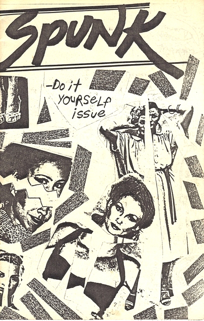
The “Do it yourself” issue of Spunk was more primitive than MT, done solely with typewriters, grease pencils and found clip art by uncredited contributors. One story, titled “Alarming News”, was based on a true incident when a phone inside the Bocock House on Franklin Street rang non-stop for almost three straight days, heard across the road in the Milhiser House by an annoyed CT staff.
Peter and Bill probably got along so well in magazine publishing because of their diametrically opposed personalities, which lent themselves perfectly to the well-defined and natural roles they assumed their magazine production, with each knowing exactly what needed to be done without stepping on the others’ toes. Peter was an intelligent, calm, level-headed pragmatist, interested in more serious, newsy articles yet open to and understanding the need for more acerbic pieces for wider audience appeal. A History graduate, Peter knew quality stuff when he saw it, even if he personally disliked or disagreed with it, and was curiously patient with a toe-hold always in the caution zone when entertaining some of the more bizarre pieces pitched to him. He was also an excellent writer himself, the fastest typist in the office, and was the one who reached out to the readerships, asking for submissions, welcoming criticism and encouraging the rest of the staff to pay attention to it.
Bill Pahnelas was to ThroTTle what Michael O’Donoghue was to The National lampoon. Armed with a degree in English and savagely brilliant in a gifted, sometimes Charles Bukowski-like manner, and flouting a penchant for excess amid explosive bursts of creativity, Bill pursued fictional and semi-fictional pieces that explored Richmond’s nasty underbelly, relishing the bizarre and incomprehensible. A fearless experimenter, he was also the magazine’s technocrat, a wizard at entering and formatting stories in the monster typesetting system and producing the complicated typography demanded by some of the magazine’s more OCD features, such as a parody of the Washington Post weather page, and page after page of tiny type of a satire of a horse-racing form. Bill was also tenacious in his adherence to scheduling and work flow, and was the one the rest had to face if they wanted to extend a deadline or swap out a story.
 |
| Cover & "ad" page from Brumfield's 1975 "1923" comic book |
In September, 1979 Fine Arts major and cartoonist Dale Brumfield was hired on the spot by the CT as a layout and paste-up artist based solely on a stack of insanely detailed hand-drawn comic books called Zip! Zap! Zowie! Cosmic Comics starring Captain Zog & his Danger Rangers that he took to Art Director Sue Dayton. Three weeks later Dayton abruptly resigned, and Dale took her place without knowing what the hell he was doing.
Like in his position at the CT, Dale was in charge of how things looked, functioning as illustrator, cartoonist, Art Director and Production Manager. He attempted to temper the sometimes absolutely incoherent design standards of Dayton, injecting a tad more common sense and consistency into the design of the magazine. His content ideas drifted consistently into parody and humor, and his off-the-wall illustrations and cartoons – with nonsense characters that shape-shifted from panel to panel – provided a distinctive graphic look not just to the CT but to all the one-shot magazines he worked on. His total lack of training in graphic design actually worked in his favor, since he was not aware of any of the rules he was supposed to follow – to the consternation of such VCU Mass Com and Commercial Art school stalwarts as Ed Arnold and George Crutchfield, who frequently held up his off-the-wall designs as horrendous wastes of space, time and money.
Rendezvous with Destiny

Finding common ground with the publishing prowess of his two senior editors, who admitted needing an art director since former director Rob (Sauder) Conrad graduated, Dale gladly took up the challenge, working not just on the CT but on a limited basis with the two of them in January 1980 for Decade of Fear (a title commemorating the election of Ronald Reagan) then later that May for a spring break publication called Destiny.
Decade of Fear was the most ambitious one-shot to date, an 8-page 11”x17” folded “half-tab”, featuring more topical news-type articles about militant Iranian students and Brazilian Indians than fiction or poetry. “So now that we find ourselves on the edge of a new decade, what are we supposed to do?” a page 2 editorial asks, “. . . Do we make the decade, or does it make us? And who cares?”
Unlike D of F, Destiny steered away from contemporary newsiness to regain focus on creative writing, including a double-truck poetry spread (unheard of in contemporary Richmond publishing) and an excellent John Williamson-penned essay on David Bowie.
 “This is the first and probably only copy of Destiny,” Peter said on page 2, “but if you have any comments or contributions, we could possibly put them to use in our next (as-yet-unnamed) publication”, reinforcing again that they were in this business just as much for others as for themselves, and if you don’t like this magazine, or your piece did not make it in, then just hold on because another one will be coming soon.
 “This is the first and probably only copy of Destiny,” Peter said on page 2, “but if you have any comments or contributions, we could possibly put them to use in our next (as-yet-unnamed) publication”, reinforcing again that they were in this business just as much for others as for themselves, and if you don’t like this magazine, or your piece did not make it in, then just hold on because another one will be coming soon.
 A photocopied and stapled fanzine with markedly higher production values than Spunk, Destiny featured prose and poetry by not only Williamson but by local writers George Williams, David “Devo” Kehler and David Frossard. Dale contributed his first cover (An ugly mess featuring “Mr. Hodges” on the cover surrounded by toasters and birds, and a fake ad on the back extolling the virtues of cocaine made with Turkish Opium (“It’s all coke – no sugar”). Bill contributed a sad and intensely personal poem entitled “You make me Sick”. Printing was by the VCU print shop.
Ignorance of the Rules is a Great Excuse
At that same time, under the tutelage of the three renegade publishers, along with numerous other exceptionally talented writers and artists including a brilliant and completely out-of-control redhead English major named Jack Moore, the Commonwealth Times came to creative life and swept award after award at local and national levels, including a “superior” award for graphic layout at the National Collegiate Press Association (NCPA) convention in New York City in 1980 – much to the consternation of those VCU waxworks who had grown so fond of deriding the weekly student tabloid in front of their smug and condescending students.
“This is what all of you should be doing!” admonished a judge at the awards ceremony in the conference room at the former Doral Inn during the worst snowstorm in ten years, holding up to the entire convention assembly a CT cover that was nothing but a typically anal-retentive Brumfield-drawn Indian Head Test Pattern, with no headlines or anything other than a logo. “You should be having fun, breaking the rules, because this is the only chance you’ll have to do it!”
Everyone clapped appreciatively except for a smattering of CT folks, some of who were fighting sledgehammer-like Soho hangovers and trying to keep from vomiting during the awards, with the rest missing the convention completely by choosing to frequent the numerous strip joints that proliferated in Times Square at that time. Dale won an award he can’t recall for his idiosyncratic “Tidal Wave Comix” but left the plaque on the train back to Richmond.
For a magazine scorned on its own campus, it sure was getting a lot of attention nationally.
Drunk on their own praise, the CT staff returned to Richmond and set about turning college newspaper publishing on its ear. An expose about a local teenage drug-addled boy-pimp named Dickie Disgusting and photos of glory holes in the college library men’s restrooms appeared, along with a published list of the salaries of every single VCU employee obtained through freedom of information, sending faculty and student government in a tailspin, moving them to threaten to cut off all funding to that “out of control” publication that in their opinion more closely resembled the Weekly World News than a college newsmagazine. Crutchfield, Arnold and their ilk must have turned absolutely apoplectic by then, especially as the entire city saw their salaries.
Political Science professor Bob Holsworth put the salary list in a different perspective: “I don’t mind,” he told his class, “I want everyone to see how pathetic my salary is.”
But while most students enjoyed the paper (they upped the press run from 10,000 to 12,000 during this time) there was still a vocal minority that hated it. One Mass Com major who boldly chose to remain unidentified in a December 7, 1980 Times-Dispatch article referred to the CT staff as “a defensive little group of kids that think they have this wonderful mandate from the students for existing.”
“That is not the forum I want for my writing.” He or she pouted.
VCU President Dr. Edmund Ackell chimed in, claiming in that same interview that “This kind of article [Dickie Disgusting] does a great disservice to our institution, and raises a serious question in my mind about the appropriateness of the Times as it is presently identified with this university.”
8:00 am hearings convened to discuss and vote on the CT’s funding were choked by billowing clouds of cigar smoke, discharged by CT employees happy to create an even more noxious and confrontational atmosphere. The motion to defund died.
Creatively, the weekly magazine flourished. Heavily influenced by New York and San Francisco-based publications like Village Voice, Wet and Boulevards, no creative stone went unturned and even non-student artists and tenured Fine Arts instructors came up to the paper brandishing portfolios and asking for illustration assignments while Sex Pistols music boomed almost continuously. Dale related one episode of how uncomfortable it was for him to thumb through pen drawings done by a grad student who had taught him in Art Foundation three years earlier.
The CT offices themselves were works of radical art; Graffiti and murals drawn directly on the hallowed plaster walls of 916 W. Franklin proclaimed such off-the-wall zingers as “Juvenile Penile”, “No future”, “I’m a sexual intellectual” (a polite way of calling themselves a “fucking know-it-all”), “It’s not for knowledge that I come to college but to work at the Commonwealth Times”, among others.
A small storage room under the stairs leading to the WVCW radio station on the third floor was crammed with shattered wooden chairs, thrown down the long halls by editors and production people during periods of frustration when deadlines became too unbearable. A small wooden box outside the office door intended for students to pay their classified ad fees became a source for beer money on those long production weekends (although the classified ads still ran – they were just free).
The office walls became so off-putting for some that a non-student visitor to the CT complained in a letter to President Edmund Ackell that they were “not unlike the walls of psychopathic mass killers”, although her basis for comparison is suspect.
The precedent set during those years (with the exception of the Manley Vigor flyer) was that nobody working in publications with these guys should settle for the ordinary or the mediocre. VCU suddenly grew up during that time as an urban institution and the CT was as likely to be picked up and read by Richmond residents, artists, businesspeople, even winos as much as by students, and the staff wanted the magazine to reflect that diversified market.
The bar was set extremely high. Editors from other college newsmagazines visited the graffiti-strewn offices, wanting to experience the craziness and see if they could soak up some of that creative miasma. College-boy cartoonists who brought up Doonesbury-style “comix” yuk-yuking about dorm life and cafeteria food were told, thanks but no thanks, as were writers who could not break the waxwork Ed Arnold/wire service mold. Snit-filled photographers who scrawled “Do not tilt!” and “Run as is!” on the backs of their “precious” snaps did not last long, as pictures were tilted, cut up or manipulated in any way that best suited the layout. Get used to it, they were told, or feel free to start your own magazine.
That attitude (along with the multiple beer consumption, chair throwing and chain smoking by the production staff) probably ran off a lot of potential talent but it retained an extremely dedicated core group of individuals that could think of no other way to spend their entire weekend than manually piecing together a 32-page magazine of which they were intensely proud. Was it a clique, as charged by student government types? Of course it was – just like student government.
This was the almost contradictory highly structured yet intensively inventive environment that created all the one-shots and that ultimately led to the spawn of ThroTTle.
Accelerating into the Eighties Broke and Unemployed
Conversation between Peter, Bill and Dale in the Stuffy’s on Harrison Street, Summer, 1980:
Dale: We should do another magazine.
Peter: I don’t know about that.
Bill (to Peter): Skeptics like you have held up progress for centuries.
When Peter and Bill graduated and VCU let out for the summer of 1980, the honeymoon suddenly ended. Those two, along with Dale, plus current San Francisco graphic designer Ronnie Sampson found themselves without jobs, so with nothing else to do and with almost no money they created a clever 24-page fanzine called Rockets and Weenies in celebration of July 4th.
 |
| Rockets on one side . . . |
Rockets and Weenies was born after the guys attended the most remarkable Independence Day weenie roast of all time, held in the courtyard at 916 West Franklin Street and subsidized and prepared by another CT staffer named Howard Greene (Howard famously asked Bill and Dale if they would go buy beer and handed them a $100 bill – probably not a good idea). “I had a note mature” Howard explained, perhaps somewhat confused when Dale and Bill returned with a truckload of Black label beers and handed him only a couple of wadded ones and some change from the c-note.
 |
| . . .Weenies on the other. |
R&W was two magazines spliced together: after reading 12 pages about rockets, the reader merely had to flip it over, back-to-front, and enjoy 12 pages about weenies. R&W featured no prose or poetry, or even current news items, focusing instead on bizarre collages and drawings that sometimes had nothing to do with rockets or weenies (or anything else). It was free-form, stream of consciousness gonzo publishing made with whatever the creators found lying around, including anonymous clip art, stray pieces of press-type, medical photos, a picture cut from a Japanese porn magazine found in the bottom of a filing cabinet, and a feature called “Cooking with Weenies: Rose Kennedy shows how” (“Have the cook throw a couple in the microwave, then enjoy them on a bun”).
 |
| Sample page from Rockets & Weenies |
Of course, the problem was about money. Thankfully, the urge to publish was greater than the concerns for paying for it, so Peter (recently hired by the Goochland Gazette) ponied up the bulk of the $250 needed to pay the Ashland Herald-Progress for printing 1,000 copies of a standard 11”x14” tabloid. The group sweet-talked CT Editor R. Steven Landes (now a Virginia state delegate) into letting them contract the use of the CT’s typesetting and Photostat equipment.
Over Christmas break Peter, Bill and Dale, along with Ronnie, Mass Com freshman Genny Seneker and Jack Moore (with Michael S. Fuller cooking the books) assembled all the materials and put together what became the inaugural issue of “unnamed tabloid publication”.
Several names for the magazine were kicked around: Twisted was liked by some but it sounded too much like Cracked. Mangle was suggested, as was Drive Your Car and Full Throttle, which was a crowd pleaser, but shortened to Throttle (without the capital Ts) for lack of room on the masthead..
“Brains for the future, unlimited, in association with Wholehog Productions, brings you this copy of Throttle, a magazine of acceleration for the eighties” stated the “Essential Data” on page 2.
True story: the creation of the logo with the three capital T’s was in fact a typesetting accident; since all type in those days were formatted on a cumbersome CompEdit system with embedded commands, an errant />cap< command resulted in the strange capitalization. Dale shrugged, claiming that it suited him fine, and that accident remained somewhat the standard until the logo was redesigned by Dorothy Gardner in 1985. The phrase “The Magazine of Acceleration for the Eighties” was a joint creation of Bill and Peter, capitalizing on the “reckless speed” aspect of the magazine name and the sometimes unorthodox creation processes. “Acceleration for the Eighties” eventually became the name of ThroTTle’s corporate parent when the magazine became legitimate later that same year.
Contributors in that seminal issue included not only the principals but AP photographer Tim Wright, former CT Managing Editor Dale Davis, Rob Sauder-Conrad, Graphic Designer Nancy Martin, Kevin Giocabbe, D. Shone Kirkpatrick, Paul Mazzuca and current author Susan Higginbotham.
The Brumfield-designed cover photo of a retro teen girl with giant pasted-on eyes and lips fondling car tires was lifted off a 1946 Life magazine. A centerfold story by Peter was about the grand opening of the brand-new Interstate 295 and a cruise down it taken by him, Sauder-Conrad, Brumfield and Seneker in his pea-green 1975 Valiant. At the time Sauder-Conrad had been the subject of a Times-Dispatch article on his espousal of a half-serious movement called “Cruising for Peace”, suggesting that if we all went cruising in our cars and burned up all our gasoline there would be nothing left to fight over, ergo the article’s title “Twisted Tots go Cruising”. Rob even had t-shirts printed with the phrase “Cruising for Peace”.
When passing through the then-Boulevard toll booth at the beginning of their “cruise” on New Year’s day, 1981, Peter told the toll taker they were “going cruising”. “Oh, don’t do that!” the woman exclaimed, thinking he had told her they were “going crazy”. Dale also started that issue what turned into a year-long Lampoon-like feature with “Tonight’s TV”, a compendium of fake analog television listings.
Brumfield and Sampson also created a ThroTTle mascot, a 7’-7” woman called “King-Size Peggy”, which was actually Dale with Ronnie’s trench coat pulled up over his head and a female mannequin head (found in a Grace Street dumpster) tied on top with a scarf. Ronnie took various photos chronicling “Peggy” creating the first issue, which can be seen elsewhere on this website.
Peggy could also be seen at VCU’s summer freshmen orientation sessions, holding an intentionally misspelled “weclome to VCU” sign and waving out the second-floor window of the Milhiser House at cringing incoming freshmen and their somewhat befuddled parents until Student Activity Director Ken Ender told them that Peggy had to go away.
Highly Irregular
ThroTTle was never meant to be sequential – it was published under the unspoken understanding that it was going to be a one-shot, just like all the others that preceded it. There were no plans at that time of a second one.
The process behind publishing that first issue – like all the others – was highly organized and disciplined, despite the chaotic appearance the magazine periodically took. Type flow was structured, with specific rules for editing and entering onto floppy disc, with deadlines strictly adhered to. Layout grid sheets were blue-lined in advance by Dale, with every headline, drawing and photo planned in advance. It was serious business, with nothing done by the seat of anyone’s pants, because as Peter and Bill stated a year later in a 1982 interview that if you impress with your personal integrity and professionalism, people will see you have credibility, even if sometimes they think you are incredible.
Offered free of charge, Volume 1 number 1 of ThroTTle Magazine hit the Richmond area book, record stores and restaurants around January 14, 1981. Every issue got picked up. Several readers wrote and called, asking when the next one was coming out.
“Everyone can talk about these trying economic times,” Peter said in that same 1982 interview, “but they are also trying cultural and intellectual times as well. Richmond has continued to grow ever since the Richmond Mercury and whatever other magazine in Richmond has gone under. There continues to be in this city people who are interested in reading something beside what they read in the Times-Dispatch and the News Leader.”
“As long as people are responding to us,” Bill added, “we’re verifying that need.”
Coming next: “You guys want to do another ThroTTle?”
Subscribe to:
Posts (Atom)